Your Homepage Should Answer the Sales Call Before It Happens

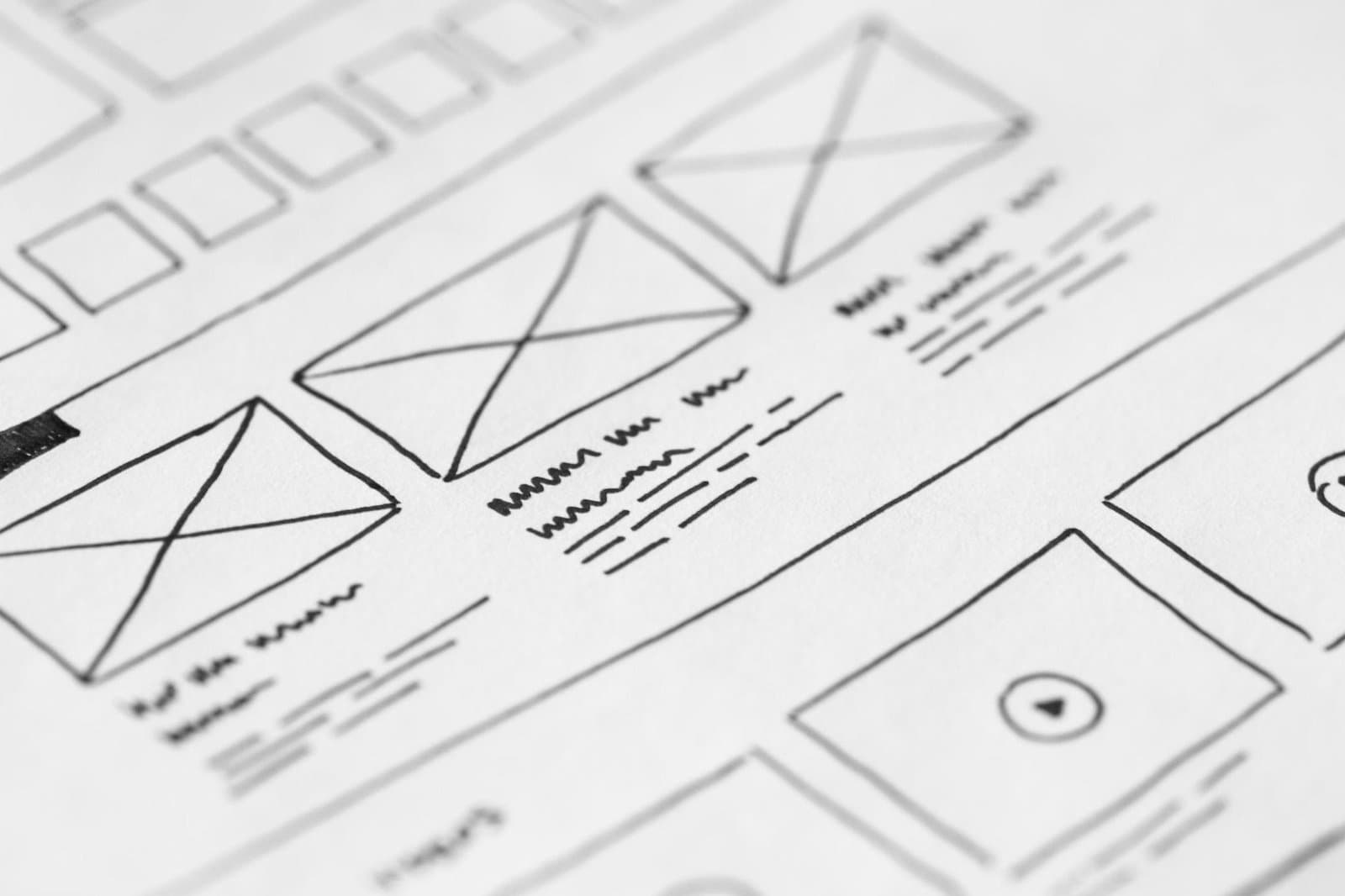
A homepage is not a brochure cover. For most service businesses, it is the first sales conversation a buyer has with you. The page should answer the questions a good prospect would ask before they decide whether to book a call.
That changes the job of the homepage. It is not there to impress other designers. It is there to reduce uncertainty, show fit, and move the right person to the next step.
Start with buyer questions
Most weak homepages talk about the company too early. Stronger ones make the visitor feel understood first. They name the problem, the type of customer served, the result offered, and the reasons the team can be trusted.
If your sales calls always explain the same three things, those answers belong on the page.
Make the next step obvious
A homepage does not need ten competing calls to action. It needs one primary path for serious buyers and a secondary path for people who are still researching.
- Say who the offer is for.
- Show what happens after someone reaches out.
- Use proof close to claims.
- Link to deeper service pages where details matter.
- Remove generic sections that do not help a buyer decide.
The best homepage feels less like a billboard and more like a prepared conversation.
List the questions qualified buyers need answered
Before estimating the homepage sales journey, map the questions a qualified buyer must answer before agreeing to a conversation. Include the trigger, final outcome, information used, and person accountable at each handoff. The map need not be elaborate; it needs to make missing ownership and hidden assumptions discussable.
A common failure occurs when a polished homepage describes values and capabilities but never states the customer, problem, outcome, proof, process, or next step. The worst version of this problem can look successful at the interface while failing elsewhere in the business. Following the handoffs exposes where a clean screen depends on manual cleanup, delayed messages, or unsafe defaults.
Walk through a development-partner comparison
A visitor comparing development partners wants to know whether you handle their platform, the type of engagement you offer, how discovery works, and what evidence supports your claims. The homepage can answer briefly and link to deeper service and case-study pages.
Annotate the scenario with decisions and handoffs. At the point where the first checkpoint (“Write down the ten questions repeated on sales calls”) occurs, identify the source of truth. When the second checkpoint (“State the audience and valuable outcome in the first screen”) follows, define what confirmation reaches the next person and what happens if it never arrives.
Turn sales-call answers into useful page sections
For the homepage sales journey rollout, implement along the workflow rather than by disconnected screens, using these checks:
- Write down the ten questions repeated on sales calls.
- State the audience and valuable outcome in the first screen.
- Place specific proof beside the claim it supports.
- Explain the next step, response time, and expected preparation.
- Offer a research path for visitors who are not ready to inquire.
Within the homepage sales journey implementation, require a demonstrable result at each handoff and preserve enough context for diagnosis. An owner should be able to answer what happened, whether it is safe to retry, and who communicates with an affected user.
Measure qualified movement, not button clicks alone
Measure qualified inquiries, visits to evidence and service pages, form completion, repeated pre-sales questions, and reasons opportunities are disqualified. Review the full chain instead of optimizing one component. A local speed gain can simply push work downstream. Combine technical telemetry with queue length, correction effort, and customer completion.
A homepage cannot close a complex sale or answer every edge case. Too much detail can bury the primary path, so deeper answers belong on focused pages. Put this caveat beside the workflow map so future expansion does not quietly cross the safe boundary.
Re-map the homepage sales journey using actual post-launch behavior. Compare the designed handoff for the first checkpoint (“Write down the ten questions repeated on sales calls”) with evidence, then examine delays surrounding the second checkpoint (“State the audience and valuable outcome in the first screen”). Missing confirmation is often the earliest sign of operational debt.
Assign each weak handoff an owner and a verification method. Automate the third checkpoint (“Place specific proof beside the claim it supports”) only after the team can explain its failure and recovery behavior.
Pair “Explain the next step, response time, and expected preparation” with “Offer a research path for visitors who are not ready to inquire” in a post-launch check. Exercise both with a normal case and an awkward exception, then measure the time required to understand and correct the result. Capture missing permissions, stale instructions, and manual work as concrete improvements to the homepage sales journey.
Next step: Compare the homepage with recent sales-call notes and add the most important unanswered question this week.
Photo by picjumbo.com on Pexels.

Written by
Adrian Saycon
A developer with a passion for emerging technologies, Adrian Saycon focuses on transforming the latest tech trends into great, functional products.