Put Website Chat and Messenger in One Place

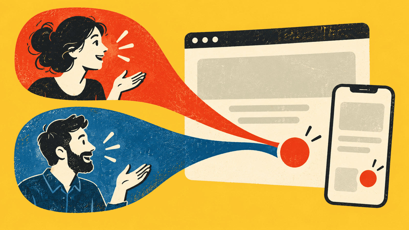
Website chat and Messenger can both be useful, but each extra floating button takes space away from the page. On the Adzbyte Solutions website, I brought those choices into one launcher. Visitors choose website chat or Messenger from the same place.
The work involved more than changing how the button looked. I needed to consider loading delays, closing and reopening chat, phone screens, and what happens when the chat service doesn’t respond. Those are useful questions for any business reviewing its contact options.
Offer a clear choice without guessing for the visitor
The launcher shows both channels to visitors. It doesn’t decide which one to offer based on country detection. Someone can choose the method that suits them without needing to understand why the website thinks one option is better.
For a business owner, the labels should describe what will open. “Website chat” and “Messenger” are clearer than two different icons with no explanation. If a channel has different opening hours or a slower reply expectation, put that information where the person is choosing it.
You may only need one channel. The right number depends on where your team can actually respond. Adding another contact option creates another place to check, so decide who will cover it before making it prominent on the website.
Let the page keep doing its job
I kept the shared launcher aware of the site’s mobile action bars. The contact controls needed to stay clear of the important page actions instead of covering them. When chat expands, the layout also needs to account for the larger space it uses.
Open your site on a phone and visit the pages where someone is most likely to ask for help. Check the form’s send button, checkout controls, booking actions, and any fixed buttons near the bottom. A chat bubble can look harmless on the homepage while covering something important elsewhere.
Try the page with the phone keyboard open too. Someone writing a message or filling a form has less usable space. The contact control should still be understandable without forcing them to close the keyboard just to find the action they need.
Load chat when someone asks for it
In this implementation, the website chat service loads after the visitor selects it. The initial launcher can offer the choice without starting the full chat widget immediately. I also kept the connection reusable so normal navigation doesn’t needlessly end the conversation.
That is an implementation choice, not a measured claim that the site became faster by a particular amount. If speed is the reason for your own change, compare the relevant page behavior before and after it rather than relying on how a feature is described.
From the customer’s point of view, the important detail is feedback. After they select chat, they should know that something is loading. A button that does nothing visible can look broken even when the service is still trying to connect.
Give a slow connection a useful way out
The launcher includes a timeout and retry when website chat stalls. Messenger remains available through the chooser. That gives the visitor another action instead of leaving them with an endless loading state.
I also accounted for someone closing the chooser while chat is loading. They may have changed their mind or found the answer on the page. The interface should respect that choice rather than opening something unexpectedly after they moved on.
Ask for these situations in a demonstration. Start chat, close it, reopen it, and try a failed load. Check that the page still offers a clear contact route. The easiest version of a feature to show is usually the successful one; the waiting and recovery states deserve a look too.
Check that people can open and close it comfortably
The shared chooser supports keyboard dismissal and returns focus to the launcher. That lets someone continue using the page after they close the contact choices. It also helps avoid leaving keyboard users wondering where they are.
The recorded checks for this change included component tests, narrow-screen review, and opening and closing the real website chat widget in a normal browser. No chat messages were sent during that integration check.
For an owner review, ask a colleague to find contact, choose a channel, and return to the page. Watch where they hesitate. You don’t need an elaborate usability study to notice a close button they can’t find or a contact option that covers the next step.
Choose who checks each channel when the usual person is away. The website can offer both choices all day, but it still needs clear reply expectations that match the people available to answer.
Measure a channel choice honestly
The site records which channel someone selects. That is a selection event. It doesn’t prove that a conversation started, a useful enquiry arrived, or a sale followed. Keep those meanings separate when reviewing reports.
The change gave the website one place to offer its two contact channels, with handling for slow loads and phone layouts. Whether that arrangement suits your business depends on how customers use it and how reliably the team responds. Start with a contact route people can find and a process the business can maintain.

Written by
Adrian Saycon
A developer with a passion for emerging technologies, Adrian Saycon focuses on transforming the latest tech trends into great, functional products.