Accessibility Problems Usually Show Up at the Worst Part of the Funnel

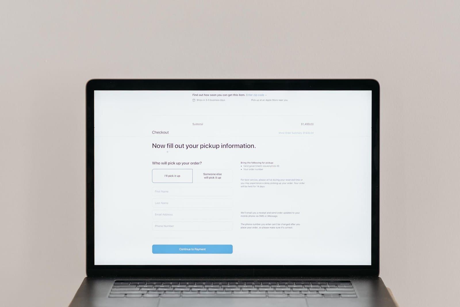
Accessibility is often discussed as a compliance issue, but the business impact usually appears in the funnel. Forms, checkout steps, account creation, booking widgets, and quote requests are where inaccessible details become lost revenue.
If a visitor cannot complete the action, the rest of the page does not matter.
The common failure points
Many issues are basic: missing labels, weak focus styles, vague error messages, poor contrast, keyboard traps, tiny tap targets, and custom controls that do not behave like real controls.
These problems are easy to miss when teams test only with a mouse, a fast laptop, and perfect eyesight.
High-value checks
- Complete the main form using only the keyboard.
- Trigger errors and confirm the message explains the fix.
- Zoom the page and check that fields remain usable.
- Test labels with browser autofill.
- Make sure the final submit action has a clear result.
Accessibility work pays off fastest where the user is trying to become a customer.
Test accessibility where intent is highest
For the accessible conversion journey, start with a service boundary rather than a feature list. The boundary is whether every person can complete the revenue or account task, not merely view the top of the page. It should identify what the system promises, what people still decide, and where responsibility moves between teams or tools.
A common failure occurs when teams audit colors on marketing pages while keyboard, label, error, focus, and timeout failures block checkout or form completion. The damage is more than rework: ambiguous boundaries create inconsistent customer answers and fragile internal workarounds. Finding them during a tabletop exercise is far safer than finding them during a campaign or incident.
Form validation reveals failures a visual audit misses
A lead form may look accessible until validation moves focus nowhere, errors rely on red borders, the date picker traps keyboard users, or a success message is not announced. Those defects occur exactly where intent is highest.
Expand the example into three passes: normal use, invalid input, and an unavailable dependency. For each pass, verify the first checkpoint (“Complete critical journeys using only a keyboard”) and observe whether the second checkpoint (“Check names, labels, instructions, errors, and focus order”) leaves enough context for a safe retry or human decision.
Build manual task checks into delivery
For the accessible conversion journey rollout, a practical first pass should follow these controls in order:
- Complete critical journeys using only a keyboard.
- Check names, labels, instructions, errors, and focus order.
- Test zoom, reflow, contrast, and reduced-motion behavior.
- Use native controls before custom widgets.
- Include people with disabilities in research where feasible.
Within the accessible conversion journey implementation, do not mark a checkpoint complete solely because code exists. Ask an operator to demonstrate the outcome and explain the fallback. Keep the answer with the implementation so future changes preserve the reason behind the rule.
Measure completion barriers, not scan scores alone
Track completion by device and assistive-technology signals where privacy permits, accessibility defects by journey, support reports, automated findings, and time to remediate. Use trend and distribution, not a single snapshot. Compare intended outcomes with operational cost, and investigate whether improvements for one audience hide regressions for another. Record the decision produced by each review.
Automated scanners detect only part of the problem, and conformance does not guarantee a pleasant experience. Manual task testing and user feedback remain essential. This boundary should shape scope, documentation, and escalation instead of being buried in technical notes.
Review accessible conversion journey after the team has handled routine and exceptional cases. Sample evidence for the first checkpoint (“Complete critical journeys using only a keyboard”) and inspect where the second checkpoint (“Check names, labels, instructions, errors, and focus order”) needed manual intervention. The goal is to distinguish a rare edge case from a recurring design flaw.
Prioritize the flaws that create incorrect data or blocked users. Turn the third checkpoint (“Test zoom, reflow, contrast, and reduced-motion behavior”) into a repeatable control, and explicitly accept or remove anything the team cannot maintain.
Test the last two checklist items together: “Use native controls before custom widgets” and “Include people with disabilities in research where feasible.” Run the sequence once normally and once with incomplete information. A person outside the implementation team should be able to identify the outcome and next action. Any guesswork belongs in the maintenance backlog for the accessible conversion journey.
Include one deliberately boring maintenance task in the release plan: checking that assumptions still match reality. Dependencies change, staff roles move, content ages, and user volume grows. A quarterly sample is often enough to reveal drift before it becomes an incident. For the accessible conversion journey, start with a service boundary rather than a feature list. The boundary is whether every person can complete the revenue or account task, not merely view the top of the page. It should identify what the system promises, what people still decide, and where responsibility moves between teams or tools.
A common failure occurs when teams audit colors on marketing pages while keyboard, label, error, focus, and timeout failures block checkout or form completion. The damage is more than rework: ambiguous boundaries create inconsistent customer answers and fragile internal workarounds. Finding them during a tabletop exercise is far safer than finding them during a campaign or incident.
Form validation reveals failures a visual audit misses
A lead form may look accessible until validation moves focus nowhere, errors rely on red borders, the date picker traps keyboard users, or a success message is not announced. Those defects occur exactly where intent is highest.
Expand the example into three passes: normal use, invalid input, and an unavailable dependency. For each pass, verify the first checkpoint (“Complete critical journeys using only a keyboard”) and observe whether the second checkpoint (“Check names, labels, instructions, errors, and focus order”) leaves enough context for a safe retry or human decision.
Build manual task checks into delivery
For the accessible conversion journey, record what was sampled, what differed from the documented behavior, and who will make the correction. This small habit is more dependable than assuming a successful launch proves the workflow will remain healthy on its own.
Next step: Run the primary conversion journey without a mouse and fix the first blocker before polishing less important pages.
Photo by Pavel Danilyuk on Pexels.

Written by
Adrian Saycon
A developer with a passion for emerging technologies, Adrian Saycon focuses on transforming the latest tech trends into great, functional products.