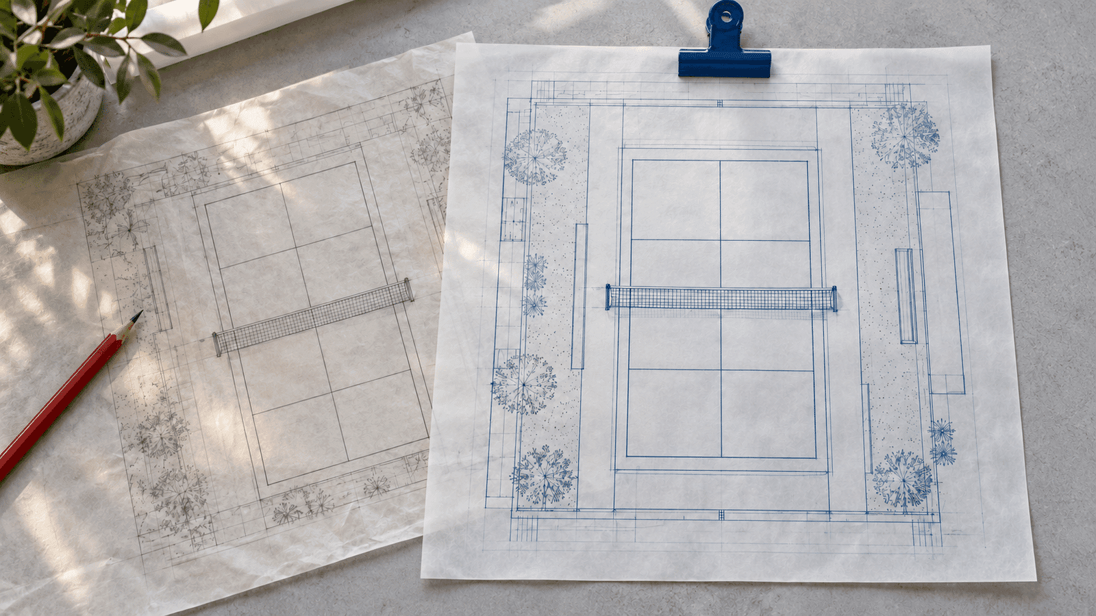
Balance Mixed Image Galleries Without Cropping

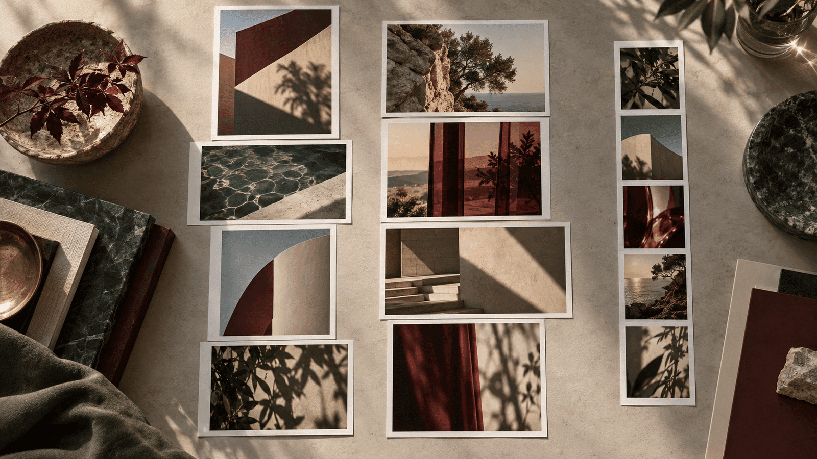
The portfolio gallery had to hold landscape screenshots and taller illustrations in the same section. Treating every image as if it belonged in an equal-height row wasn’t a good fit for that content. The images needed to keep their own proportions, and captions needed to stay attached.
Two small changes in our gallery code show how specific this decision can be. The first used CSS columns. The next replaced that with two independent desktop columns and a separate mobile list. Neither change was a new image-processing system or a height-measuring layout engine.
Start with the shape of the actual content
The gallery takes images from a case study and filters out the featured image by its identifier. That avoids repeating the same image in the gallery just because it also belongs to the case-study data. It keeps the content selection separate from the layout decision.
The test fixture includes one landscape image and one portrait image with different dimensions. That’s a useful starting example because equal-sized placeholders would hide the reason for changing the layout. A gallery can look perfectly tidy with uniform sample cards while still handling real project imagery poorly.
Before choosing a layout, I’d also ask whether order carries meaning. A set of independent project views has different needs from a sequence explaining a process. The layout should follow that answer, especially when the desktop reading path differs from the mobile one.
Keep the figure whole
The first change moved from a two-column grid to CSS multicolumn layout and added a rule to keep each figure from breaking inside a column. It retained the image and its optional caption in the same figure. That’s the right unit to reason about: a caption floating away from its image would make the gallery harder to read.
MDN’s multicolumn guide describes how content flows through columns. That model is worth understanding before treating columns as interchangeable with rows of grid items. Changing the container can change how people move through the content.
The image styling kept full available width and automatic height. There was no new fixed-height crop. That lets a tall screenshot remain tall rather than cutting away the part someone needs to inspect.
Choose what independent columns really mean
The follow-up change made the desktop layout explicit. Even-indexed images go into one array, and odd-indexed images go into the other. Each array renders inside its own vertical stack, with the two stacks arranged in a grid.
That gives each column its own spacing without tying every image to a shared row height. It also means the implementation distributes by position, not by measured height. A run of tall images at even positions can still make the first column much longer.
I wouldn’t call that a shortest-column algorithm. There isn’t code measuring a figure, comparing accumulated column heights and choosing the smaller side. This version distributes images by position, so that is the behavior to document.
If a future gallery needs closer height balance, I’d first test representative content. Adding measurement and rearrangement creates more moving parts, including how late image loading and captions affect the result.
Keep a straightforward mobile reading order
The revised component renders a single source-order list for smaller screens and hides the desktop columns there. On desktop, it hides that list and shows the two independent columns. A shared figure component keeps the image, dimensions, alternative text and caption markup consistent between both render paths.
Separate responsive trees need care. A DOM test can see both trees even though CSS only displays one at a time. Tests that query an image globally may therefore become ambiguous. Scope the assertion to the layout you’re testing and check the visible result in a browser too.
This approach also deserves a review if gallery items gain interactive controls. Duplicated identifiers, stateful widgets or focusable content can make two render paths harder to maintain. The current image-and-caption figure is a much narrower case.
Review image sizing and evidence separately
The gallery passes a full-width size hint for the mobile list and a half-viewport hint at the desktop breakpoint. MDN’s image reference explains how sizes participates in responsive image selection. The hint should describe the displayed slot closely enough to be useful.
A half-viewport hint is still an approximation when the gallery has a maximum container width and gutters. Review the browser’s selected resource at representative widths rather than assuming a size string proves optimal downloads. The commits don’t include a measured bandwidth saving, so there’s no reason to claim one.
The updated test checks that the desktop container has two columns, then verifies which image appears first in each. It proves the intended structure. It doesn’t prove equal column heights, every possible reading order or the visual quality of a long gallery.
For a final visual check, use several image ratios, captions of different lengths and an odd number of images. Inspect the narrow layout as carefully as the wide one. The useful result is a gallery that preserves the work and reads sensibly, with layout claims that match the code doing the job.

Written by
Adrian Saycon
A developer with a passion for emerging technologies, Adrian Saycon focuses on transforming the latest tech trends into great, functional products.